Highlight Bloom and Photoillustration Look
Replicating a 'Lucisart'/Dave Hill type illustrative look

Replicating a 'Lucisart'/Dave Hill type illustrative look
Over in the forums community member Sebastien Guyader (@sguyader) posted a neat workflow for emulating a photo-illustrative look popularized by photographers like Dave Hill where the resulting images often seem to have a sort of hyper-real feeling to them. Some of this feeling comes from a local-contrast boost and slight ‘blooming’ of the lighter tones in the image (though arguably most of the look is due to lighting and compositing of multiple elements).
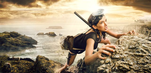
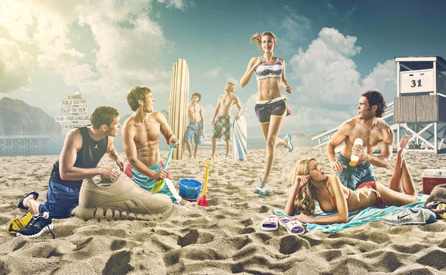
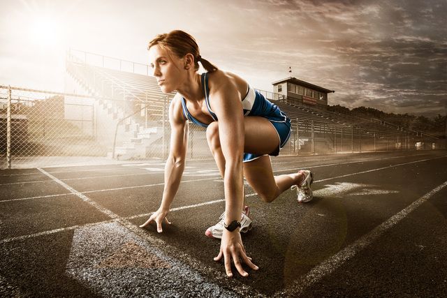
To illustrate, here are a few representative samples of Dave Hill’s work that reflects this feeling:

A video of Dave presenting on how he brought together the idea and images for the series the first image above is from:
This effect is also popularized in Photoshop® filters such as LucisArt in an effort to attain what some would (erroneously) call an “HDR” effect. Really what they likely mean is a not-so-subtle tone-mapping. In particular the exaggerated local contrasts is often what garners folks attention.
We had previously posted about a method for exaggerating fine local contrasts and details using the “Freaky Details” method described by Calvin Hollywood. This workflow provides a similar idea but different results that many might find more appealing (it’s not as gritty as the Freaky Details approach).
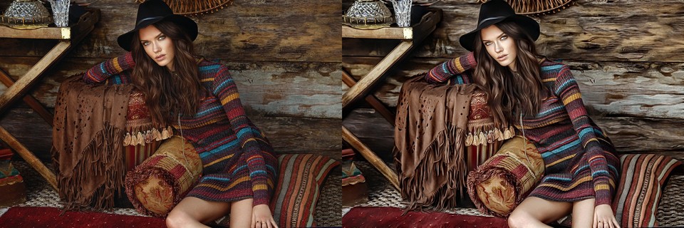
Sebastien produced some great looking preview images to give folks a feeling for what the process would produce:
Sebastien’s approach relies only on having the always useful G’MIC plugin for GIMP. The general workflow is to do a high-pass frequency separation, and to apply some effects like local contrast enhancement and some smoothing on the residual low-pass layer. Then recombine the high+low pass layers to get the final result.
Testing → Photocomix → Photocomix smoothing
Set the Amplitude to 10. Apply.Details → Simple local contrast
Using:Artistic → Graphic novel
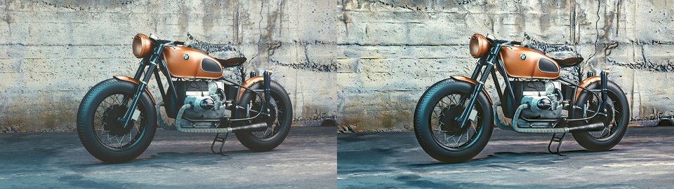
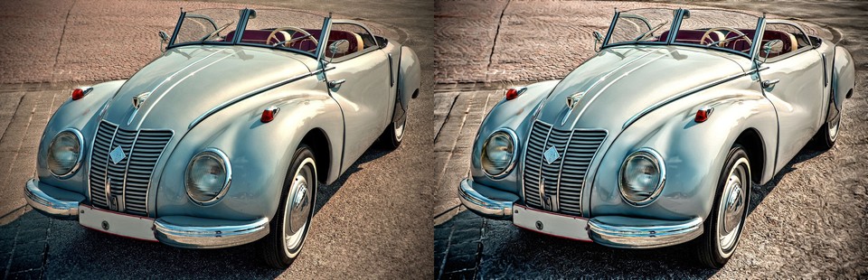
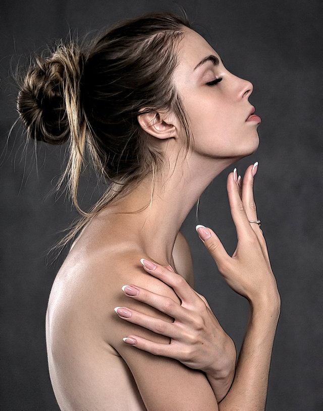
Using:Let’s walk through the process. Sebastien got his sample images from the website https://pixabay.com, so I thought I would follow suit and find something suitable from there also. After some searching I found this neat image from Jerzy Gorecki licensed Create Commons 0/Public Domain.
The first steps (1—7) are to create a High/Low pass frequency separation of the image. If you have a different method for obtaining the separation then feel free to use it. Sebastien uses the Photocomix smoothing filter to create his low-pass layer (other options might be Gaussian blur, bi-lateral smoothing, or even wavelets).
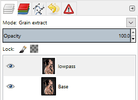
The basic steps to do this are to duplicate the base layer, blur it, then set the layer blend mode to Grain extract and create a new layer from visible. The new layer will be the Highpass (high-frequency) details and should have its layer blend mode set to Grain merge. The original blurred layer is the Lowpass (low-frequency) information and should have its layer blend mode set back to Normal.
So, following Sebastien’s steps, duplicate the base layer and rename the layer to “lowpass”. Then open G’MIC and apply:
Testing → Photocomix → Photocomix smoothing
with an amplitude of around 20. Change this to suit your own taste, but about 1% of the image width is a decent starting point. You’ll now have the base layer and the “lowpass” layer above it that has been smoothed:

Setting the “lowpass” layer blend mode to Grain extract will reveal the high-frequency details:

Now create a new layer from what is currently visible. Either right-click the “lowpass” layer and choose “New from visible” or from the menus:
Layer → New from Visible
Rename this new layer from “Visible” to “highpass” and set its layer blend mode to Grain merge. Select the “lowpass” layer and set its layer blend mode back to Normal.
The visible result should be back to what your starting image looked like. The rest of the steps for this tutorial will operate on the “lowpass” layer. You can leave the “highpass” filter visible during the rest of the steps to see what your results will look like.
These next steps will modify the underlying low-frequency image information to smooth it out and give it a bit of a contrast boost. First the “Simple local contrast” filter will separate tones and do some preliminary smoothing, while the “Graphic novel” filter will provide a nice boost to light tones along with further smoothing.
On the “lowpass” layer, open G’MIC and find the “Simple local contrast” filter:
Details → Simple local contrast
Change the following settings:
This will smooth out overall tones while simultaneously providing a nice local contrast boost. This is the step that causes small lighting details to “pop”:
The contrast increase provides a nice visual punch to the image. The addition of the “Graphic novel” filter will push the overall image much closer to a feeling of a photo-illustration.
Still on the “lowpass” layer, re-open G’MIC and open the “Graphic Novel” filter:
Artistic → Graphic novel
Change the following settings:
The intent with this filter is to further smooth the overall tones, simplify details, and to give a nice boost to the light tones of the image:
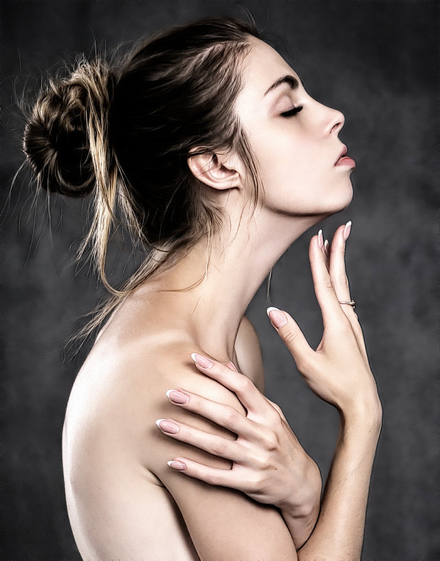
The effect at 100% opacity can be a little strong. If so, simply adjust the opacity of the “lowpass” layer to taste. In some cases it would probably be desirable to mask areas you don’t want the effect applied to.
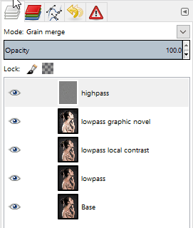
I’ve included the GIMP .xcf.bz2 file of this image while I was working on it for this article. You can download the file here (34.9MB). I did each step on a new layer so if you want to see the results of each effect step-by-step, simply turn that layer on/off:
Finally, a great big Thank You! to Sebastien Guyader (@sguyader) for sharing this with everyone in the community!
Of course, this wouldn’t be complete if someone didn’t come along with the direct G’MIC commands to get a similar result! And we can thank Iain Fergusson (@Iain) for coming up with the commands:
--gimp_anisotropic_smoothing[0] 10,0.16,0.63,0.6,2.35,0.8,30,2,0,1,1,0,1

-sub[0] [1]

-simplelocalcontrast_p[1] 25,1,50,1,1,1.2,1,1,1,1,1,1
-gimp_graphic_novelfxl[1] 1,2,6,5,20,0,1,100,0,1,0,0.78,1.92,0,0,2,1,1,1,1.26,0.37,1.05
-add
-c 0,255


Free/Open Source Photography


Unless otherwise noted content on this site, PIXLS.US by Pat David, is licensed under a Creative Commons Attribution-ShareAlike 4.0 International License.