Getting Closer
First article is mostly written
Pat David — September 25th, 2014

First article is mostly written
Pat David — September 25th, 2014
Just a quick update on a couple of interesting things.
The first article is almost done being re-written and updated.
I added some functionality to the slide-out menu and am still thinking about the best icon to use.
I also had a nice epiphany when I realized that the styling I had already written to make big videos works great for images as well.
The first article is almost done being ported and formatted. For anyone who’s curious, it’s a long post from the five part series I did on B&W conversion using GIMP (originally published on my blog).
The writing is going a bit slow because I am also feeling out the formatting and a couple of other minor visual things as they relate to a full-blown article. Of course, it doesn’t help that it’s also a really, really long article…
For those of you bothering to read this blog, and who want to take a look at the state of that article, it can be found here: Pixls.us: Digital B&W Conversion (GIMP). Just don’t forget to let me know if anything looks funky, or with any suggestions/comments/criticisms.
Speaking of which, one of my first conundrums while working on it was a question of load times vs. convenience. The original article was written as five separate blog posts which kept everything in reasonably bite-sized chunks to digest. The problem is that as a reader I am sometimes annoyed at having to click through multiple pages to read an article and I thought that most readers here might feel the same way.
One of my concerns was load times and rendering speed of large pages.
I think I have all the assets set to load as quick as possible above the fold.
I’ve tried to optimize all images as much as possible and am making sure to define discrete width and height attributes in the html to help the browser render and not have to reflow (hopefully).
There are still a few optimizations that I have to implement that I haven’t yet (minify javascript and concatenating all my stylesheets for actual delivery), but I have them in the queue to do. Oh, and spritesheets for some assets that I will get around to making soon as well.
So my current thought is to keep the articles to a single page, even if they are long. I am also 100% open to other ideas as well so if you have one feel free to hit me up!
Long pages can be a bit cumbersome to navigate, though. To help make it easier to target relevant information in the page, all of the headings in a page should have a unique id attribute. This means that users will be able to link directly to sections of a long page (this seems to have fallen out of favor with many websites - why?!).
For instance, I can link directly to the previous section of this post by including the id of the element in the url:
http://pixls.us/blog/2014/09/getting-closer/#speaking-of-long
I’m still thinking about the easiest/best way to present this capability to users, but the groundwork is there for the future.
I’m not 100% sure this is obvious, but the “px” logo in the upper-left corner of the page should slide out a navigation from the left side of the page (assuming you have javascript enabled in your browser). If you don’t have javascript enabled, then clicking the logo will take you to the footer of the page where the basic navigation links are located.
I’m also considering a re-working of the icon to possibly make it more obvious that it opens a menu. Perhaps something like the “hamburger menu icon” is in order?
The first set of links are the main ones for navigating the site Home, Blog, Articles and Software. Just below that will be the navigation links for the contents of the current page.
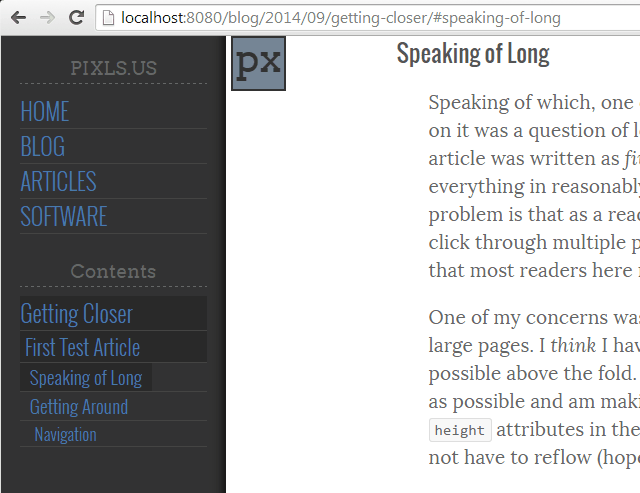
For no other reason than I thought it was neat, I also made it so that the background of each of the Table of Contents entries will be a slightly darker color relative to how far along you are in the page/section. In the example above, I have already read Getting Closer and First Test Article, and I am ~75% of the way through the Speaking of Long section of the post.
Unfortunately, this won’t work without javascript enabled. I am still thinking of a way to possibly include the TOC in the page without screwing up the layout too much. Something to play with later I suppose…
At the moment I am using a combination of serving up the images directly from my host, and using Google+ photos. Mostly because I have limited space on my webhost, and I’m not quite sure what the impact will be just yet. I also gain the distributed Google infrastructure for image hosting, which helps I think as images are by far the biggest files to serve for these pages.
I also get on-the-fly image resizing when hosting the images on Google, which is handy while I build things out.
One of the downsides is that the on-the-fly resizing doesn’t produce progressive jpegs, which I thought might help with rendering speeds of large pages (images loading progressively at least show that something is there…).
I think I mentioned it in the previous post The Big Picture that I had done the styling to get images to span the entire width of the page. In that same post I also demonstrated a means for making embedded videos bigger as well. It turned out that the same styling worked great for images as well.
Here is the lede image wrapped in a <figure> tag:

<figcaption> tag.
I can re-use the styling for the larger video to automatically make the image much larger and centered on the page:
big-vid on the figure.
And, of course, wrapping the <figure> in a <!-- FULL-WIDTH --> tag yields:
<figure> with a <!-- FULL-WIDTH --> tag and setting the class to full-width.

This works across mobile as well but I can’t help but feel it is a bit inelegant. It is also dependent on javsacript and I don’t know if there is a simple way around this. At least now, without javascript turned on, everything else still works except toggling to the comparison version.
I’d like to have at least a few good articles ready to go at launch time. As I said, I’m almost finished with the B&W conversion article, but the question is what to migrate next?
I’m thinking that one of the Open-Source Portrait posts would make a nice article to launch with as well, or perhaps an update/re-write of using Wavelet Decompose for skin retouching? If anyone has a preference or suggestion, I’m all ears!
I’m also going to publish an interview with a F/OSS photographer whose work I admire.

Free/Open Source Photography


Unless otherwise noted content on this site, PIXLS.US by Pat David, is licensed under a Creative Commons Attribution-ShareAlike 4.0 International License.